Find out the most popular ways app developers use animation to fine-tune a mobile app's UI & UX! Check out the best mobile apps animation examples that can give your projects a competitive edge.
Mobile app animations will spruce up your app’s UI and smooth out user interactions for a fulfilling UX, which is the key to increasing conversions and user retention.
We put together a list of the top mobile app animation examples to show you how much potential they hold.
Table of Contents
- Launch Screen Animation
- Onboarding (Tour) Animations
- Login Screen Animation
- Explainer Animations
- Loading Page Animation
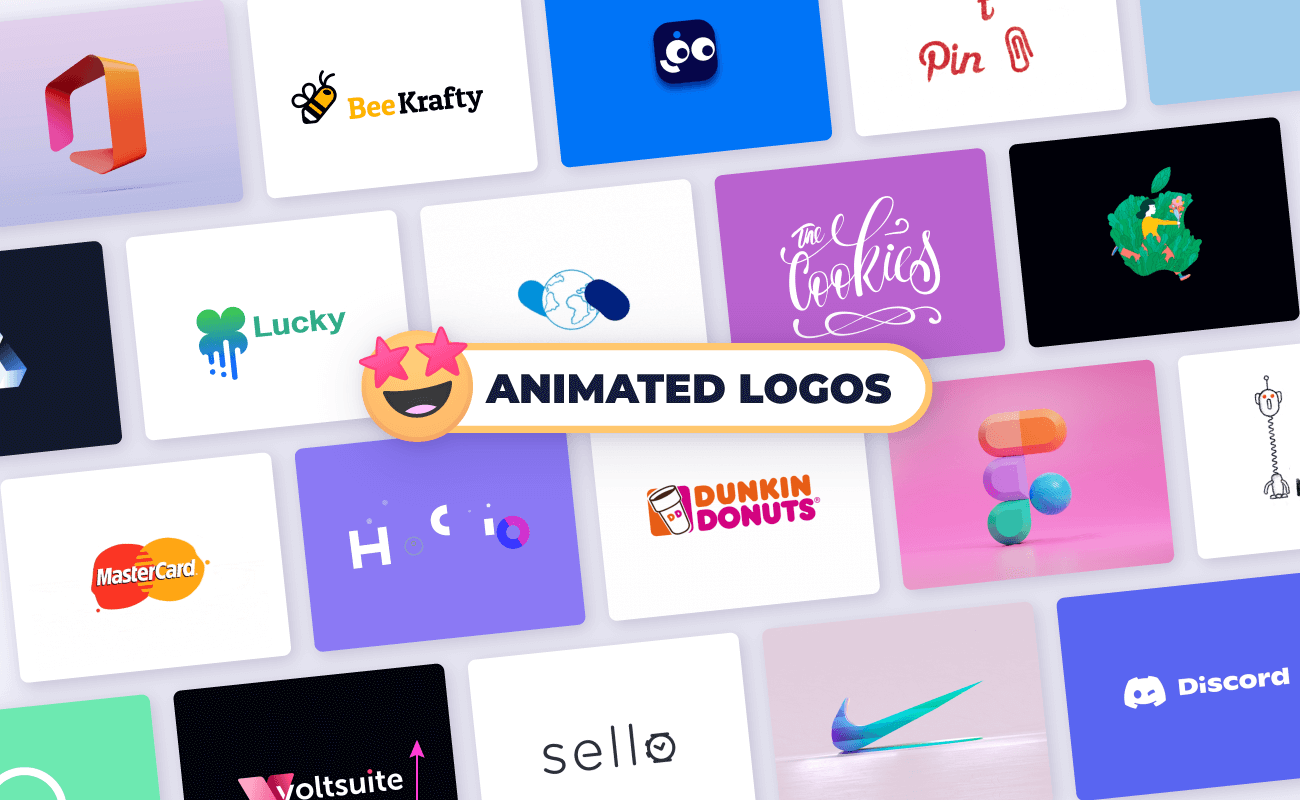
- Animated Logo and Other Branding Assets
- Success State Animation
- Button Animations
- Icon Animations
- Error State Animation
- Conclusion
1. Launch Screen Animation
How is animation used in mobile applications a high-potential branding asset? It basically allows for countless opportunities to expose your customers to your brand’s identifiers (animated logos, slogans, and taglines).
If you're designing a podcast cover for an exclusive podcast channel, consider adding animation which will make both your podcast and the podcast mobile app look appealing.
Merge your logo animation with your mobile app’s animated launch screen, and you achieve multiple goals at the same time:
- Keep the user distracted and entertained as the app is launched (a generally small time frame), and give them the impression that the app is extra fast and responsive.
- Set the tone for all the other interactions between the end user and your app’s UI with a smooth and captivating animation.
- Show your user base the elements that you want them to identify you by (like your animated logo!) and build up brand awareness with each app launch animation.
2. Onboarding (Tour) Animations
Make sure users don’t view your mobile app’s Welcome Tour as a skippable interaction! Integrate animations into your onboarding slides and pave the way for a positive first impression.
An animated walkthrough of the app will give you the chance to showcase the app’s features and what the customer stands to gain from registering for an account and logging in.
You can do the following:
- Animate the processes that your app can help simplify.
- Highlight main features.
- Showcase what sets you apart from the competition, all in three stunning slides.
With less confusion upfront comes an improved app retention rate!

Ultimately, the onboarding tour is one of the most important mobile UI interactions for a large percentage of users once they’ve downloaded your app. Use smooth SVG animations to make the most out of it!
3. Login Screen Animation
Onboarding animations for first-timers, and animated launch screens for repeat users, will help smooth the transition to your app’s login screen.
Animated login screens should be on-brand (brand colors, mascot, mood setting visuals) and on the subtle side, so you don’t end up distracting users from the ultimate goal: conversion. Keep your login screen neat and tidy, but with a personal feel!

4. Explainer Animations
Push your visual storytelling further with animations that get your point across fast and load even faster! Add explainer animations to section off essential content into bite-sized pieces that are more digestible than blocks of text.
Animations exported from SVGator are fully responsive, so they are in line with the mobile-first design approach.

5. Loading Page Animation
Like web page preloaders, an in-app loading page animation can mask wait times and prevent app abandonment by keeping frustration levels as low as possible.
This type of functional animation in UX design does more than just entertain, as it can actually serve multiple purposes:
- You can show users that the system is processing their request, and provide them with a sense of acknowledgement (e.g., show a loading animation as a user’s payment is being processed). ✅
- Loading pages make room for more branding opportunities (e.g., turn your logo into a looping preloader with self-drawing stroke-path animation). ✅
- The entertainment value of a catchy and clever loading page animation can add to the memorability of your design, which can, in turn, increase your app-retention rate. ✅


6. Animated Logo and Other Branding Assets
Blend your marketing strategy into your mobile app’s UI with:
- Logo animations
- Interactive on-brand buttons/icons
- Animated brand mascots
Don’t limit yourself to UX animation inspiration! Integrate app UI ideas that put your branding assets to good use.

Keep in mind that a branding-targeted in-app animation should be subtle enough to be unobtrusive, yet captivating enough to become a memorable part of the user experience. It can be quite the balancing act, but user testing will guide you toward a happy medium.

7. Success State Animation
Want to go the extra mile to offer a seamless in-app user experience? Animation can be the perfect tool for that, simply because it enables you to add an emotional touch to your designs.
Designing excellent user interfaces is all about enriching UX at every key interaction. After all, your success in designing better interfaces plays a huge role in customer success.
- Current graphic design trends
- Graphic design mistakes to avoid
Turning the result of an action into a dynamic event makes app users feel validated. A successful animation also reinforces the idea that your mobile app is working at peak performance levels.
8. Button Animations
Animated buttons are some of the most user-centric micro animations examples you can implement. Working with a stunningly-designed UI kit can make a mobile app’s interface look extra polished, but integrating feedback animations can work wonders for your app’s UX.

You can also increase your app’s usability with animated toggle switches that make shifting between dark mode/light mode, or list view/grid view, an intuitive interaction.
9. Icon Animations
In-app icon animations are key elements of the UI groundwork that make a mobile app easy to navigate. When you add details that contribute to intuitive navigation, you inherently also build up your app’s retention rate, because UX matters!

With lightweight SVG animation for mobile apps, you don’t have to worry about increased load times or other performance downfalls. If you plan on designing an animation-rich app UI, you can install the single-player setup (for React Native/Flutter) and have your .js/.dart file’s player load from SVGator’s own SVG player node module. This setup will help cut back APK and IPA file sizes even further.

10. Error State Animation
When done right, animation for app design can help ease the tension that comes with encountering empty/error states. These instances are inevitable, but with a bit of transparency and clear communication, you can redirect users to continue enjoying the app.
Use a neat and straightforward error screen tagline to show your audience that your mobile app takes a user-centered approach even when delivering bad news. Attach a positive emotion to this point of friction in the customer journey with an animation heavy on self-aware humor.


Conclusion
Integrate any or all of these mobile UI animations when building an app to make its interface easier to navigate and increase your chances of connecting with customers on an emotional level.
Whether you're interested in creating a simple mobile app like a weather mobile app for Android or a complex one like the next best graphic design app for Iphone, this article is for you.
It’s now easier than ever to engage and hold mobile app users’ attention. Use our use cases as inspiration and integrate SVG animation into your app development strategy to advance your native app’s UI and UX designs! Get started here!


